A flexible design solution for a software company powered by people.

Upward

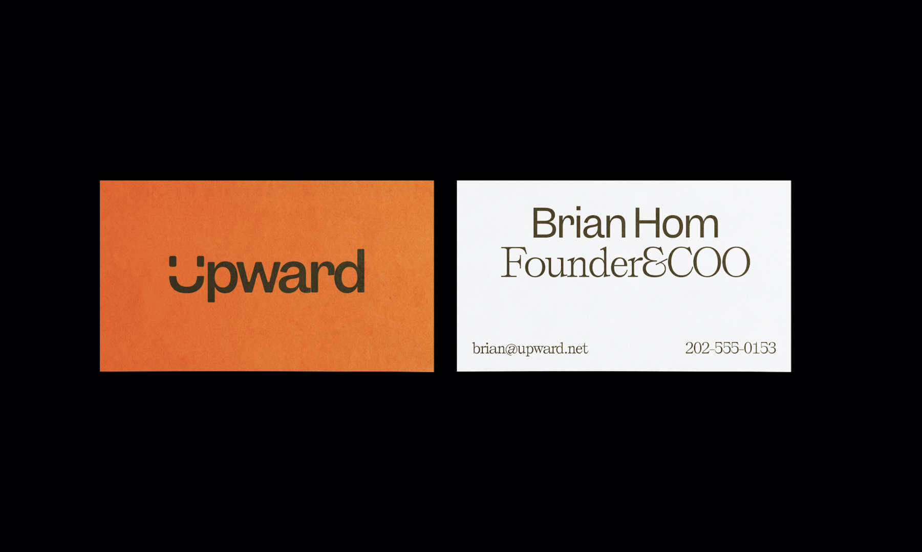
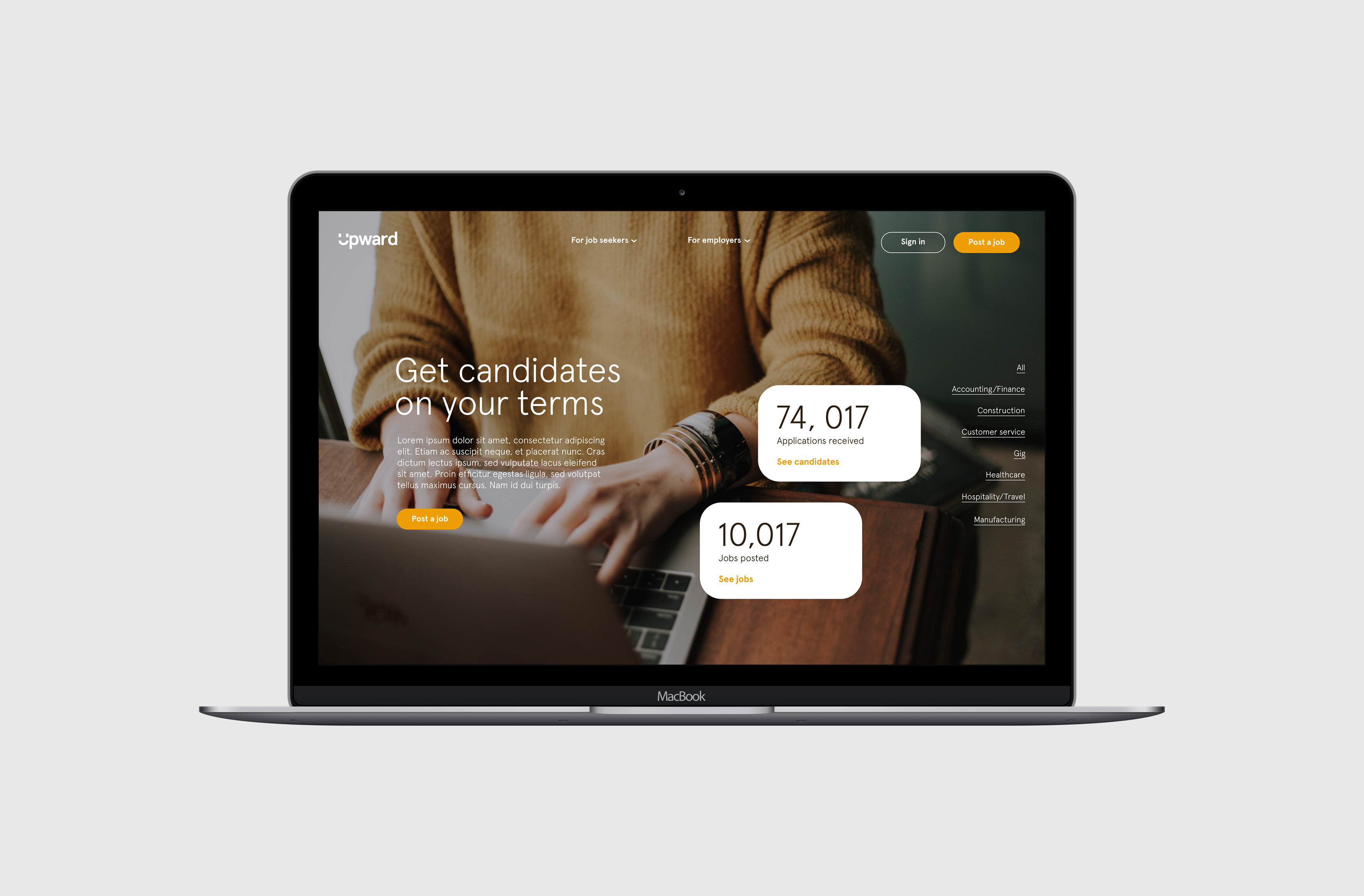
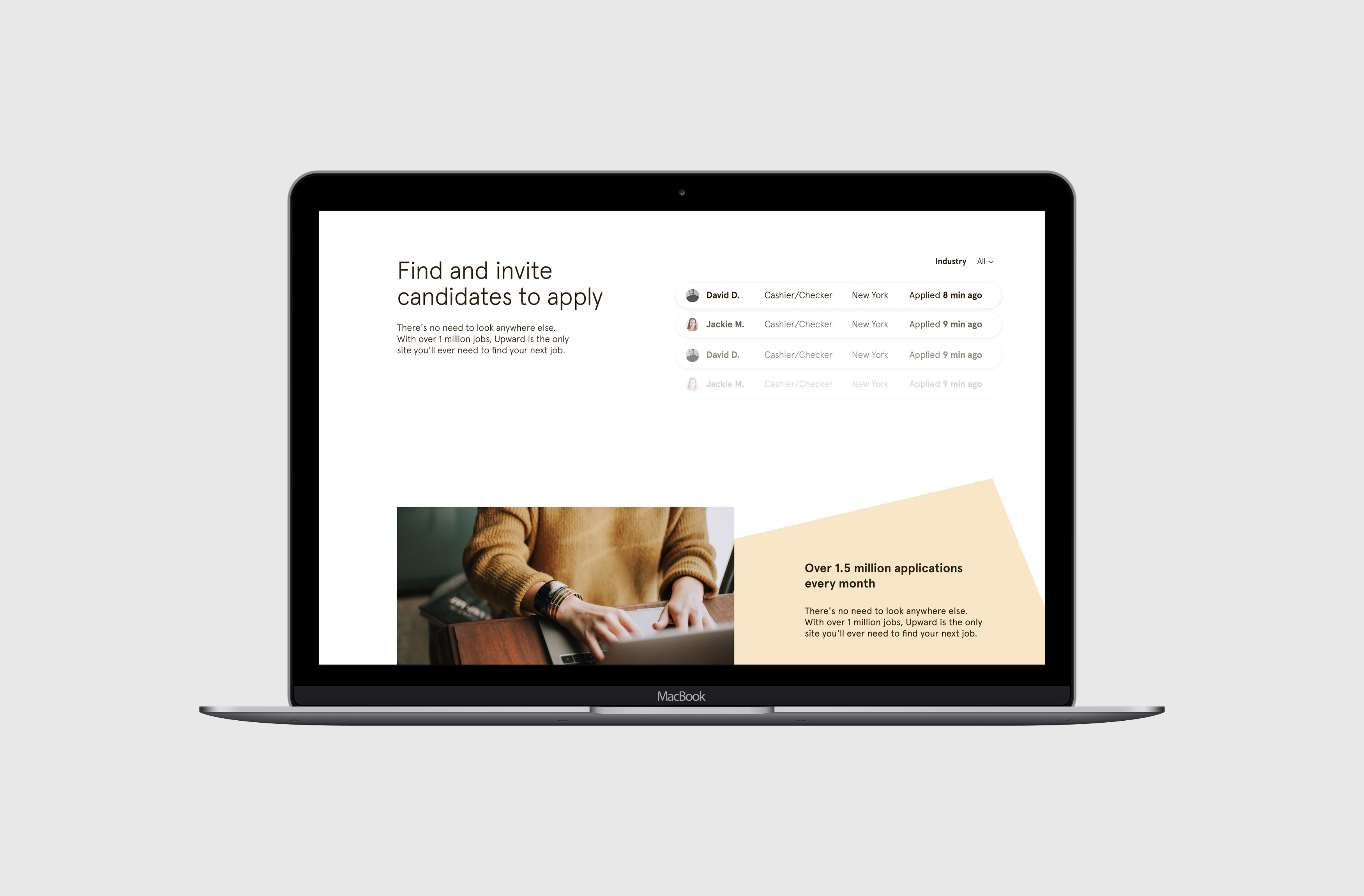
Upward sees themselves as more than a job search platform, but a partner in the employment process. This partnership is based on providing tools to businesses that help solve the perennial challenge of hiring the right people. More than an algorithm that spits out search results, Upward is valued by their customers for the “human advantage” that compliments their enterprise software—a truth CEO Brian Hom wanted to emphasize in the company’s brand identity. Beck & Stone was brought on to bring this emphasis into reality.

For a brand to portray an organization’s services and values authentically, we must think on not only what it does on a professional level, but what it means on a personal level. What then does Upward mean to the internal team, their job seeking users, and their enterprise partners? Yes, Upward is a platform—an “it”—that you can use to fill a job or find a job. These are things that it does.

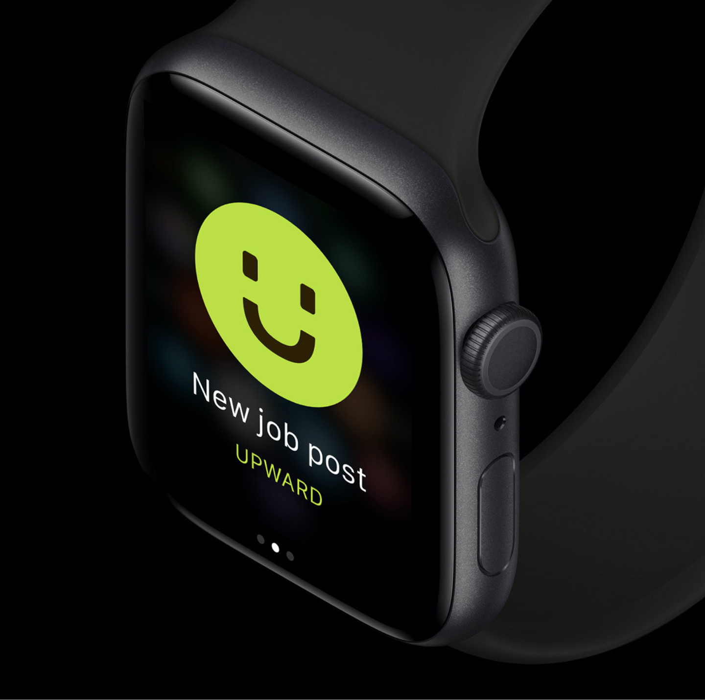
Yet software must be more than a thing with which our users interact, but be controlled by some-one who is their consultant and guide. SaaS is not only technology, but a partner empowered by technology who assists people in making choices that make them happy. And a successful hire for the employer and the employed means mutual benefits of respect, fulfillment, and productivity. In short: a good job and a good employee brings happiness.

The cornerstone of the new Upward brand identity—the logo—reflects the humanity of the company in the typography and icon. The sinuous shapes of the letters such as the ‘a’ and ‘r’ bring tactile warmth and craft to the wordmark. The “U” doubling as the Upward smile, is a casual, professional nod to the human truth of finding happiness in good work with helpful people.

A visual identity is more than a logo. It is a bespoke visual architecture that in its totality shapes the mind’s perception of the brand. The new Upward design system embodies a diverse, vibrant company whose mission is to help hire people of every shape, size, and color. It stands in remarkable contrast from its competitor brands who dwell in the land of corporatized, techie sameness, commonly referred to as “clean”.

Upward can own its face symbol —much like Uber owns their solid “U”— and render it in a variety of special ways for campaigns or other destinations. Such is the power of a solution designed with flexibility in mind.

This bespoke art direction which combines photography and illustration to give Upward a friendly, contemporary yet distinctive tone, sets it apart in the tech field. Rather than individual artwork that needs to play the part of “hero”, we opted for cohesiveness and scalability, devising a criterion to produce imagery that could be expandable: two abstract shapes cutting into each other, and two photographs to be placed at their intersections.

The illustrations are corporate and business-minded, but daring and different from the cookie-cutter aesthetic of happy stock models or floppy-armed illustrated characters so often seen in the competition. They are flexible and adaptable; they can animate, morph, and change the imagery according to situation and medium. They play wonderfully with the color scheme and a myriad of photography. These loose rules allow the art direction to be deployed by the in-house team or creative professionals without losing fidelity.

From print to digital, billboards to app icons, the proof of concept is dynamic and exciting. Colors combine with shapes, shapes combine with photography; and typography provides the architecture for it all to happen while retaining consistency. It is as hustling and bustling, as diverse and stressing the uniqueness of each variation as the people who will use Upward to hire and get hired.

The adaptability of the design system is proven in the myriad of applications from digital, print, and out-of-home advertising to user-facing and enterprise product interfaces.

Beck & Stone works towards three goals when designing brand identities or design systems: they must be Flexible, Feasible and Future-Proof.

The flexibility of a strong visual identity allows a brand to grow organically in all its declinations. To never be painted into a corner when a new usage is required, but reflecting the character of who the brand is, what they do, and why they do it.

A feasible design system contains visual elements and rules for their usage that does not place undue burdens on the in-house team. Lowering barriers for implementation allows a system to not simply look good in documentation, but produce cohesive, quality deliverables.

Finally, a future-proof design system allows for many years of impact and usefulness. It is mindful of trends and current needs—the what—but expresses the essence of the organization that is unchanging and permanent: why we do what we do. To discover, define, and document this allows the organization to get to work growing—and to rest from the iterations of hamster wheel redesigns.

When these three goals are met, design brings alignment to an organization of what they think, feel, and do.

A year later, we are seeing this alignment taking place in Upward’s internal and external communications. They have found the place where the team is empowered, users are welcomed, and client partners are inspired.