A bespoke identity for a planned giving initative.
The New Criterion

The mark is inspired by the seals of European trade guilds in the same period; most recognizably, the East India Company.
The Galliard Society child brand inherits characteristics of The New Criterion parent brand, yet stands alone—with the connective tissue being the font, art direction, and copywriting. It distinguishes itself by the heavy use of Galliard’s small caps, a darker color palette, and more subdued tone in its brand voice.
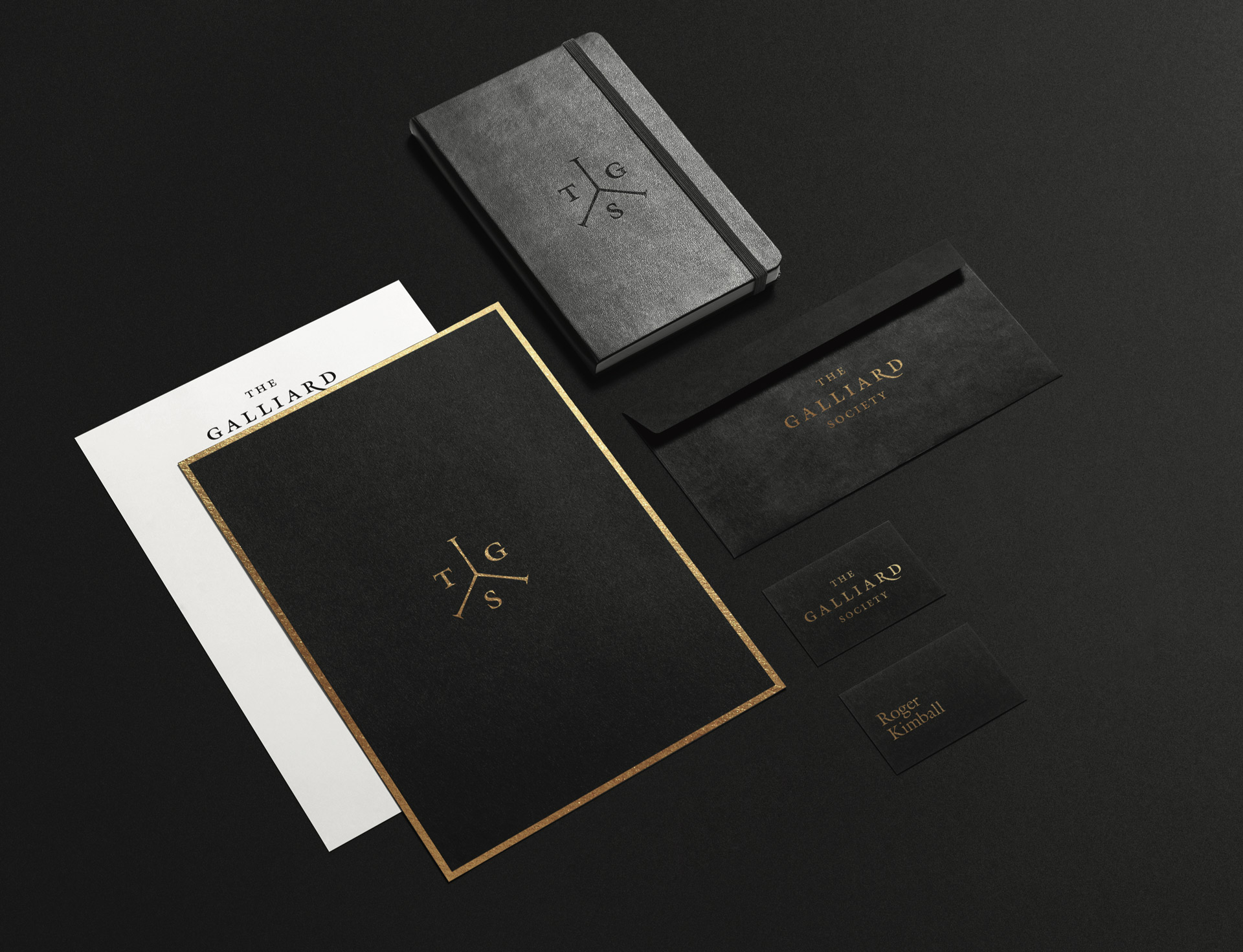
The New Criterion brand is unapologetically high brow. For this inner circle of supproters, the exclusivity needed to be apparent from the very first touchpoint and at each subsequent one. From the printed materials to the digital assets, each deliverable is carefully designed to bring bold touches of the brilliant gold on the weight of stately black.
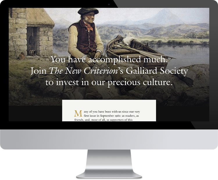
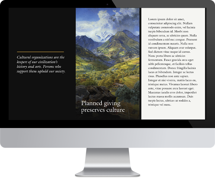
We created a deep-scroll, responsive microsite for The Galliard Society, findable but standing alone in newcriterion.com, to be a destination for direct mail, email, and inbound marketing efforts. &