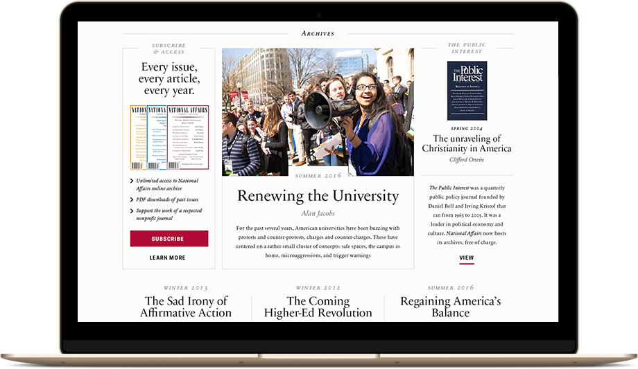
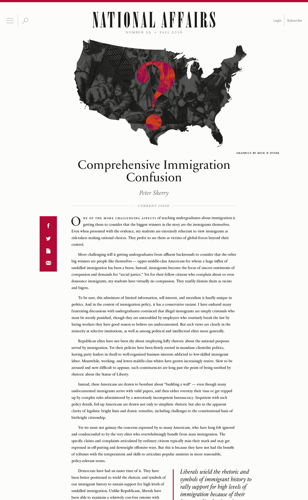
Cultivating niche communities is a baseline strategy across our services at Beck & Stone. For a magazine with such a narrow target audience, the priorities are much different. There are few if any advertisements, only ones carefully selected by the editors. The initial design and ongoing optimization of a website that caters to paying readers—not advertisers—is critical to seeing success overall.
The primary trait of such a website is a premium reading experience, one that impresses new readers and retains current subscribers.
For National Affairs, readable type in a clean layout was a given intense scrutiny, considering their print edition is purely text-based.
We want readers to pick-up a magazine, open a webpage, email a PDF, or a print an article, and know they are reading National Affairs. A logo at the top of a page is not enough. The spacing of columns and the hues of the website were tested rigorously across devices and mediums to remind readers of the look-and-feel of the printed magazine. Consideration for the subtleties of impeccable typography like drop caps, block quotes, kerning, leading—intricacies that are typically afterthoughts for others, are an obsession in our work.
To have found an appreciator of those details in National Affairs, both in the performance of their software and the design of their reade’s experience, set a standard for policy journals that is still referred to by many in the Washington circles today. &
1The Public Interest was a public policy journal that National Affairs sees as a predecessor and is the caretaker of their archive.


