Case Study January 2014
First Things: Website Design
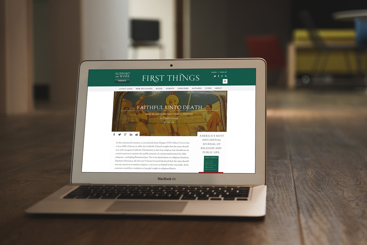
A new digital home for America’s most influential journal of religion and public life.

First Things is an academic journal published 10 times a year by the Institute on Religion and Public Life. Founded 25 years ago to give voice to religion in the public square, the publication features commentary, essays and poetry from respected scholars in the religious community. But even with a monthly readership of over half a million, First Things recognized the need to evolve the brand’s digital experience by refreshing their flagship site, firstthings.com, and expand their online reach.
01.
The Challenge
First Things engaged Beck & Stone in early 2013 to completely overhaul its flagship site. Here’s how we saw the challenge: to craft a responsive editorial experience that would handle greater amounts of content while performing effortlessly and fluidly on any device, without sacrificing First Thing’s signature style and smarts.
In less than 6 months from initial meetings to deployment, we created a faster, cleaner, fully-responsive FirstThings.com that stays true to the brand’s editorial legacy while meeting the user needs and habits of their modern reader.
The Beck & Stone team took the initiative from the very beginning of the project, helping us better define our goals in the digital environment. The results have been outstanding. Their work has moved us forward, improving our brand and expanding our readership.

Editor
02.
The Process
As a boutique brand and design consultancy with deep business consulting capabilities, we were able to bring a more agile approach to workflow, collaboration and project management.
Strategy
We began by introducing a more unified collaborative process, quickly sourcing appropriate vendors and keeping in close communication with in-house editorial teams and stakeholders. Our strategists researched the evolution of First Thing’s reader behaviors and consumption habits, especially on mobile and tablet, and used our findings and insights to map more intelligent user-flows, scenarios, SEO tweaks, and reframe their digital content strategy to sync more tightly with the core subscription model.
Design
Our creative team came to the drawing board in the design phase knowing we needed to preserve the look-and-feel of the First Things brand, while creating a magazine-like experience that was dead-easy to read, share, and navigate. The modules, tables, graphic elements and typography of the section and article-level pages mirrored the visual language and classic design aesthetics of the print product: modern, tasteful and sublime. For the headers and navigation bar, we incorporated the solid pastel colors that are the trademark of First Thing’s Pentagram-designed magazine covers, changing to coordinate with each month’s new issue.
Development
FirstThings.com was built with a custom content management system. We worked tightly with a cross-disciplinary group of expert technologists from our development partner Level2 to bring the new designs to life in code. In addition to the CMS, we migrated a large digital archive of articles, while making sure multimedia content types like videos and audio podcasts could be added smoothly. In the front-end, we integrated and styled an open-source commenting system--where the passionate discussions of First Thing’s readers happen--so the dialogue could continue seamlessly.
01.
The Result
The entire site is now an elegant, typographically-rich design that echoes the white space and clean lines of the printed page, allowing both the first-time and returning reader to get comfortable and immerse themselves in the long-read.
Unobtrusive sharing options make it easier to share articles with your social networks, and smarter tagging makes it easier to find more interesting content after you’ve finished an article. The entire site is responsive, optimized for desktop, mobile and tablet.