On Design Criticism, Inspiration, and Purpose

Thought
Graphic designers must resist trollism by not losing sight of the craft's ultimate goal.

We live in a golden age of design. Computers have given us powerful tools to push the boundaries of possibility while reducing the learning curve, bringing droves of new talent into the industry. Computers have also given designers an awareness of the design community's work– with the means to criticize that work as soon as we see a glimpse of it on the web: instantly, instinctively, and quite often ignorantly.

Armin Vit at UnderConsideration recently wrote on the outrageous reaction to the redesigned Verizon logo:

Old and New Verizon Logo
Had this new Verizon logo been created by Unimark during their heyday we would be collectively ponying up almost a million dollars for its guidelines and we would hail it as a classic. Seriously, take your fingers off of your keyboard for a minute before you type “this sucks” and think about it. Isn’t this the wet dream of every designer who praises the neutrality and perfectness of Helvetica? It’s one of the largest corporations in the world and it’s going the full Swiss style and y’all are complaining?

Vit is pointing out the hypocrisy of designers who will lament over their American SMB clients not seeing the brilliance of black sans serif type on a white background, yet react with such phrases as “I could do better than that in Microsoft Word” to a giant, boring American corporation signing off on such a minimalist identity.

A valid observation. I am interested though in the why. Why do designers fund a Kickstarter for reissues of the NYCTA Graphics Standards Manual that Vit describes as an “orgy of Helvetica” and a campaign to preserve NASA’s worm logo, yet foam at the mouth in righteous indignation when one of us uses the iconic font or creates something we don’t “get” right away? (By the way, the new Verizon identity is in Neue Haas Grotesk, not Helvetica, but I digress.)

I fear designers, with our aggrandizing live tweeting of conference talks and “THIS”-ing of Medium rants, our Pinterest boards of inspiration and double-tapping of black-inked typographical murals, have become too smart and too self-aware for our own good. We subconsciously think we have reached a state of judgement where we can give another designer’s work a once-over and raise or lower our thumb in perfect confidence of correctness; simply because it does not match the visceral appeal of what we are accustomed to seeing in our cultivated circles.

Beck & Stone Manager Icon

There is an idolization of what we consider timeless and scorn for what we deem unoriginal, yet I do not believe the line between the two are as clear as we make them out to be.

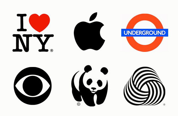
Famous Logos

In a New York Times interview, Alton Brown talked about how “the ‘pornification’ of food takes away the importance of sharing it with one another and instead focuses only on the food.” When asked if the food media (i.e. the Food Network) bears some responsibility for that, he responds: “When you take a subject that becomes a massively popular phenomenon, like food, it’s mirroring other things in society as much as it’s driving things in society.”

I wonder if this age of instant exposure has done the same to graphic design. The effect that education and “inspiration” have had upon the design world is a two-edged sword. Designers have become more informed about what the rest of the community is doing, but less aware of why they are doing it. We are quick to form opinions that match the herd's, and do little to impact the zeitgeist by straying too far into the Land of Vanilla for fear of the herd’s criticisms or neglect. This is not healthy for design or designers.

Design is critical thinking made tangible in order to meet a predetermined goal.


If you truly believe that, then ask yourself what the purpose behind the endless sea of logos, icons, and layouts created on –let’s take Dribble– truly is? If your answer is “just inspiration” then you have answered correctly. There is no client. There is no goal other than displaying production skills and pandering to the rest of the community for affirmation. It is a vacuum. But design does not exist in a vacuum. There is always a goal that transcends the visual layer you judge at first glance. (Paul Adams wrote on this subject of “Dribblisation” better than I ever could. Do read.)

Inspiration does not equal education. And by that I do not mean formal education, but educated decision making. Being able to identify the real-world challenges of your client and all the accompanying factors is the first step in a successful –not a pretty– design execution. This vision should be the primary focus of a designer, because it is very much a part of the design process, especially with branding projects.

To create a singular graphic that meets the criteria of all communication mediums, the technical considerations of current assets while planning for future assets, and striking an emotional chord in human beings for the purpose of spurring them to action, is the glorious pinnacle of graphic design.

In an unaired interview, Steve Jobs talked about Paul Rand, whom all designers worship, and summed up (perhaps ineloquently) what I think should be a designer’s mission statement, regardless of what they are working on or who they are doing it for. Paraphrased:

Paul is a very interesting intertwining of a pure artist and somebody who is very astute at solving business problems. If you scratch the surface on any of his work you find out the depth of the intellectual problem solving that has taken place. And yet when you first see it, it’s wonderfully emotional.

I wonder how the design community of Twitter and the blogosphere would react if the Apple logo was revealed for the first time today? It is silly to think of such things, however, for hindsight will always be 20/20. We’ll probably be campaigning for a petition to get Apple to bring back the rainbow-striped version any day now.

Beck & Stone Director Icon

When I see a designer who is quick to give an opinion on another’s work without attempting to retrace the thought process behind it, I see a designer who is very tied to the opinions of others in their own work.

But no one is paying designers for the opinions of their peers. Clients trust a designer who will listen to them about their problem and then think for themselves on how to solve it. It is why the Verizon redesign, like a host of other much-derided Pentagram identities, will ultimately be a success. Does that make me personally like it? It certainly does not. But what I like and what I think is best are not one in the same. They can be mutually exclusive. I do not think I have earned the right to think of my opinion in such a high-minded manner.

I was once told by a client when I expressed worry over the loss of creativity that production design work often entails:

“Andrew, I know many creative people, who can all do many creative things for creative purposes. But you are one of the few who can do creative things for business purposes.”

The project we were working on is inconsequential. I actually have forgotten what it was exactly. But I still hold this in my mind as the greatest testimonial anyone could give me. It is a reminder that a successful design is not measured simply by its instant visual appeal, but by the actions it prompts and the perceptions it shapes. &